




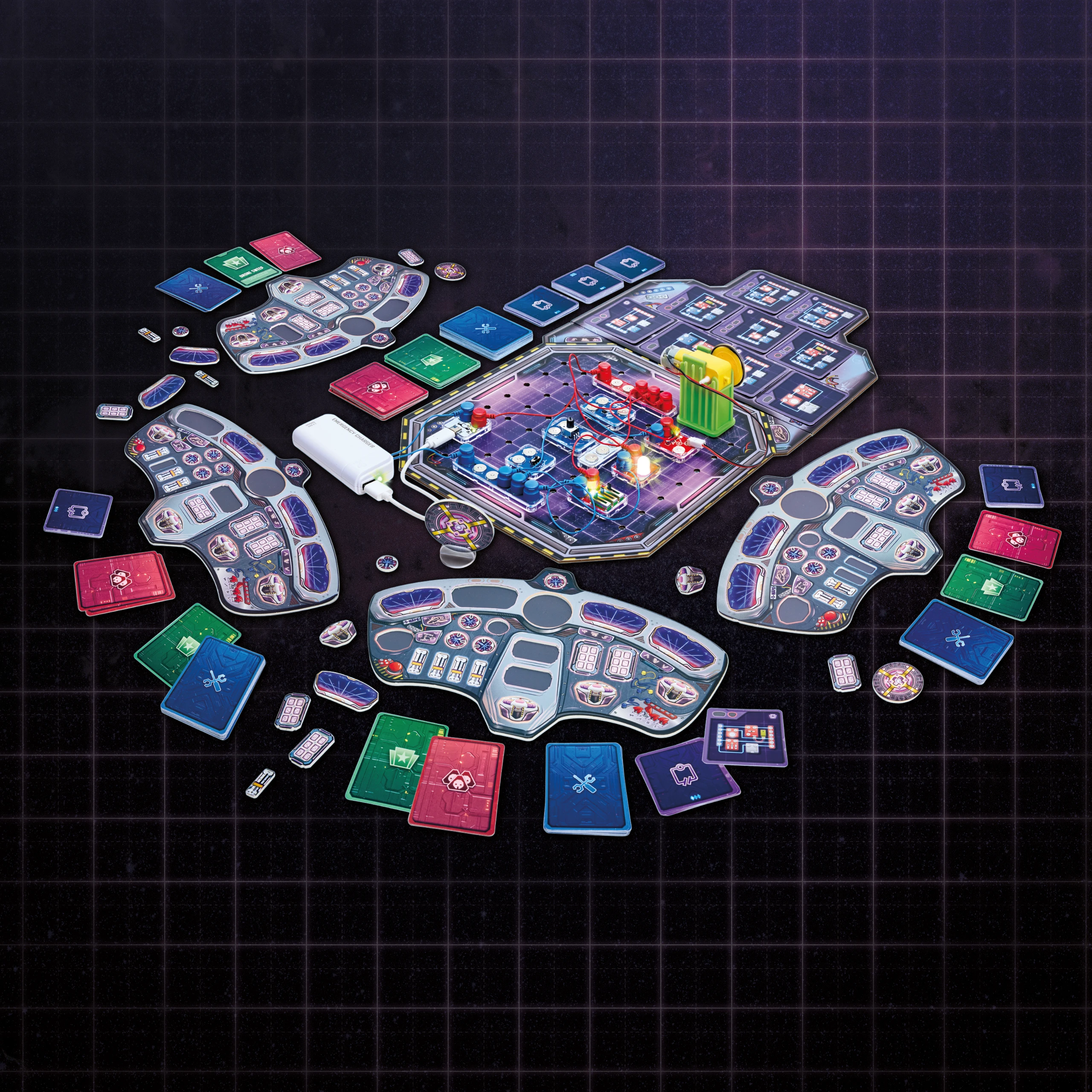


Von Retro-Sci-Fi zur eigenen Welt
The artistic style was inspired early on by retro science fiction animated films. We’ve added our own twist to this aesthetic, making it interesting and cool without leaning too heavily into science fiction. It’s a balance that appeals to a young, learning audience without excluding older players.

Interaction ideation
The space setting was specified by Labbox. The initial ideas centered on personalization; players were to earn spaceship components by completing circuit challenges and build their own space exploration vessels. The concept was promising, but too complex for the project timeline.


Style iterations
We have transitioned to a system in which players repair a single control panel. The visual style has been refined step by step, establishing a clear, consistent style provides the framework for all subsequent design decisions.


From Layout to Production Part
Each cockpit panel went through several stages of development, from early layout experiments and color explorations to the final details.


Cards and Iconography
More than 270 cards determine resources, challenges, and key moments in the game. We’ve developed a comprehensive symbol system in which the symbols are interconnected so that players can intuitively understand their meanings, even when they see an icon for the first time.


Each card combines the cartoon style with the corresponding Labbox block. 'Malfunction Cards' introduce unfortunate moments and add depth to the game world’s story.
Icons and Symbols


Card category symbols


Token reward

Labbox Electronic Blocks

Difficulty level
Symbol placement

Event card reward

Difficulty Level

Token reward
With 274 cards in total


Design
Play Arena
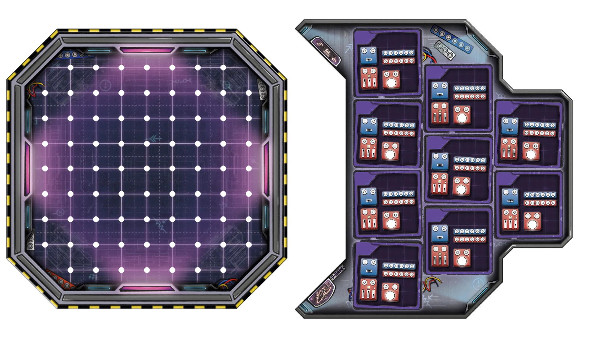
Electronic components are connected to one another using magnetic cable connectors and placed in the center of the game board. Here, players build functioning circuits. Each component has studs that allow it to be secured to the central game board.

The initial concept.
The attachment concept, to allow players to move the play area seperate from the cards on the board.
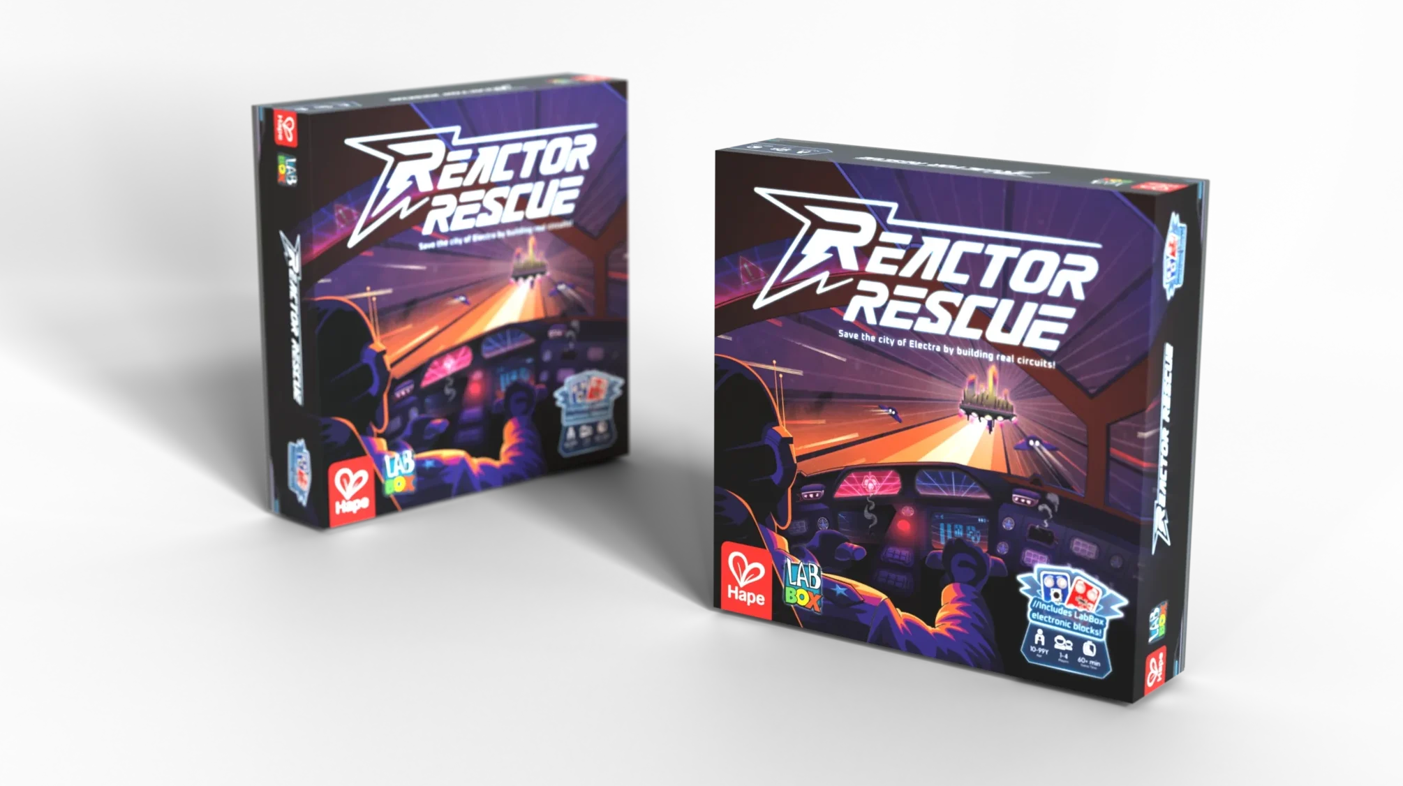
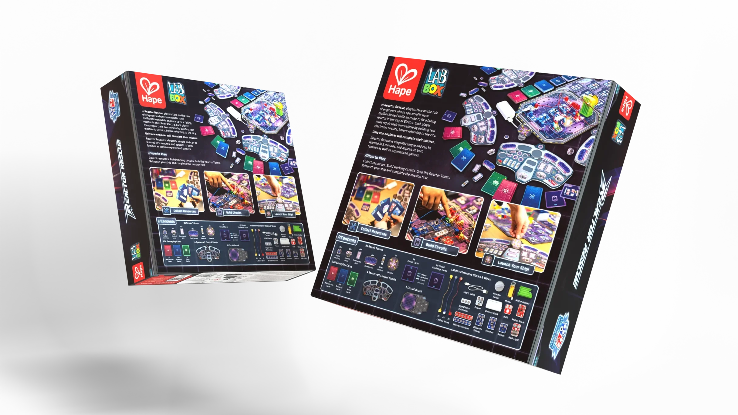
Packaging iterations
For the packaging, we used AI image generation to quickly test different design concepts. This process helped us and the client establish a clear direction, which we then refined into vector graphics and logo elements.
The central theme was changed to a character-based theme, players should feel as though they are stepping into the role of a space engineer and repairing their spaceship.
Video Content
Explainer video
We filmed and produced an explanatory video that clearly explains the game mechanics for the Kickstarter campaign and for later retail use.
Design & Strategy
Kickstarter Campaign
In addition to the complete product design, we handled the visual design for the entire Kickstarter campaign, from the campaign page to the reward graphics to social media content.
Earned
backers
Financed
Staff Pick
Award

Team-Favorit

Campaign Design in Detail
Storytelling graphics, infographics, and visual assets. Every element of the Reactor Rescue Kickstarter campaign was optimized for conversion and brand identity.


Campaign Page as a Conversion Engine
The Kickstarter campaign for Reactor Rescue was designed as a continuous storytelling flow. Each section brings the visitor one step closer to supporting the project. From the emotional sci-fi introduction to social proof quotes to the clearly structured pledge tier architecture: every design element serves a purpose.
The result: over 1,000 backers, more than €190,000 in funding, and a Kickstarter Staff Pick award, all with a goal of just €5,000.


